
If your reviews get traffic but few clicks, the cause is usually the structure of the page rather than the product or the topic. A reader who lands on a review is trying to make a decision, and each section either answers one of their doubts or leaves it open. This article breaks a review down in the order a reader meets it, so you can see what each part is for and build the same structure every time you write one.
If you want to know how to write an affiliate review that converts, start with the sequence. The order of the sections matters as much as what is in them, because readers ask their questions in a predictable order and drop off at the first one that goes unanswered.
Start with the buyer’s question, not the product’s feature list
Someone searching “[product] review” is usually close to a decision and has a specific worry. Is this the right fit for me? Is it worth the price? Will it do the one thing I need? The product’s feature list answers the company’s question (“what are we proud of?”), not the reader’s.
Before you draft anything, write one sentence that states the question your review answers. A few examples of the form:
- Is this email platform a good fit for someone with a small list who wants to send automated sequences?
- Does this hosting plan cope with a content site that is just starting to get traffic?
- Is the paid tier of this keyword tool worth it for someone who researches niches a few times a month?
That sentence decides what goes in and what stays out. A feature belongs in the review only if it helps answer the question. Features that do not bear on that decision can be cut, however impressive they sound on the vendor’s sales page.
It also helps to list the doubts a reader has between landing on the page and clicking, in the order they usually arise:
- Is this for someone like me?
- Has the reviewer really used it?
- What is the catch?
- Is there something better or cheaper?
- What does it cost, and where do I get it?
The rest of the review is built from those five doubts. Each section below answers one of them, in that order.
The opening verdict: tell readers who the product is for and who should skip it
The first screen of the review should hold the verdict. Put it in the opening 100 to 150 words: what the product is, who it suits, who should look elsewhere, and your overall judgement. A reader who has to scroll through a history of the company before finding your opinion will often go and find another review.
A strong verdict has four parts:
- What it is, in one plain sentence.
- Who it suits, described by situation rather than by demographic. “Bloggers who send one or two emails a week and want simple automation” works better than “marketers.”
- Who should skip it, also described by situation.
- Your overall judgement, stated directly.
Telling some readers to skip the product feels like it should cost you clicks. It tends to do the opposite. A reviewer who sorts readers into “this fits you” and “this does not” is plainly not recommending everything to everyone, and that makes the “this fits you” half believable. The readers who do fit keep reading with a clear sense that the review applies to them. The readers who do not fit would rarely have bought anyway, and a refund request or a disappointed buyer does nothing for your reputation.
Use the verdict to make a commitment. Avoid wording like “it depends on your needs” or “it has pros and cons.” Say which readers should buy, and under what conditions. If the answer really is conditional, name the conditions: “Choose the cheaper plan if you only need X; the higher plan only makes sense if you need Y.”
The verdict is also the first natural place for a link to the product, because by this point the reader knows what you think of it. More on placement below.
Proof you actually used it: screenshots, specifics and the details only a user would know
After the verdict the reader’s next doubt is whether you know what you are talking about. Proof of use answers it. Anyone can paraphrase a features page, so the proof has to consist of things that are hard to get without having logged in.
Good proof comes in several forms:

- Screenshots from your own account, cropped to the part that matters and captioned with what the reader should notice. Vendor press images do not count as proof, and if you use them for illustration, label them as the vendor’s.
- Specifics about the process. Where a setting lives in the menu, how many steps a task takes, what the first-login screen asks you to do, what happens when you try to cancel or export your data.
- Limits the sales page does not mention prominently, such as caps on the free or cheapest plan, or features that sit behind a higher tier.
- Results of a task you actually ran, described in terms the reader can picture, with the setup and the outcome.
Only claim what you did. If you have used the product for a particular job, say that job. If you have used one plan and not another, say which one you used and which you are describing from the vendor’s documentation. Readers forgive a limited review that says what its limits are; they do not forgive one that implies broad experience and then gets a basic detail wrong.
If you have not used the product at all, say what the review is based on instead: the vendor’s documentation, a public demo, a free trial, or published feedback from other users. A review labelled that way can still help a reader compare options. It simply cannot claim the credibility of hands-on use, and it should not borrow the language of it.
Captions are worth the effort. A screenshot with no caption forces the reader to work out why it is there. A caption such as “The export options on the cheapest plan: CSV only” tells them what to take from it and shows that you noticed.
The honest drawbacks section that makes your recommendation believable
The drawbacks section carries more weight than most affiliate writers expect. A review made up entirely of praise reads like an advertisement, and readers treat it like one. A review that names real problems gives the praise credibility, because it shows you were looking for problems and reported what you found.
Weak drawbacks are generic and harmless: “it has a learning curve,” “it may be pricey for some.” Those say nothing, and readers recognise them as filler. Useful drawbacks name the situation, who it affects, and what to do about it. The form to follow is:

- What the limitation is.
- Which kind of reader it affects.
- Whether there is a workaround, or whether it is a reason to choose something else.
For example, if a tool restricts a feature on its cheapest plan, say which feature, say what a reader would need to do to get it, and say what that does to the real cost of using the product the way they probably intend to.
Not every drawback should be treated the same way. Some are minor and do not change the verdict; say so and move on. Others change who the product suits; those belong in your verdict at the top as well. If you notice a drawback so serious that you would not recommend the product to your own target reader, the honest move is to change the verdict, not to bury the drawback.
Place this section after the proof and before the pricing. By then the reader believes you have used the product, so the criticism lands as informed. It also puts the “what is the catch?” doubt to rest before price comes up, so the price is read in light of the full picture.
Pricing and alternatives: helping the reader compare without leaving your page
Readers who are ready to buy will compare. If your page does not help them do it, they will open another tab to do it themselves, and you lose control over where they end up. Put the comparison on your page.
For pricing, state what the plans cost and what differs between them, and give the date you checked. Prices and plan limits change, and a figure with a date next to it is more trustworthy than one presented as permanent. Check the vendor’s pricing page on the day you publish, and again whenever you update the review. Do not quote a price you have not verified. If you cannot confirm it, send the reader to the pricing page and describe the plan structure instead.
For alternatives, pick two or three that a reader would realistically be weighing. A short comparison of each, covering who it suits, how it differs, and where it is stronger than the product you are reviewing, does more for a reader than a long list of competitors. If one of them is a better fit for part of your audience, say so. That is the same sorting you did in the verdict, applied to the market. Where you have your own review of an alternative, link to it, so a reader who leans that way stays on your site.
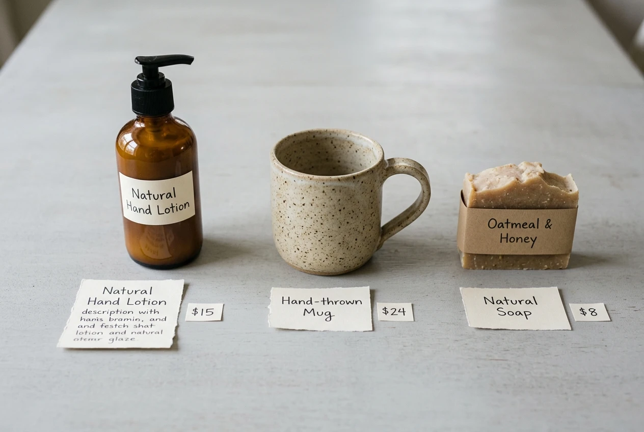
A simple comparison table works well here: one row per product, with columns for who it suits, how it is priced, and its main limitation. Keep the cells short.
Price also affects how much of the earlier work a review needs. A reader considering a small monthly subscription needs less convincing than one considering a large one-off purchase, and the longer, more detailed proof is for the second reader. The article on high-ticket versus low-ticket affiliate offers covers how to match the offer’s price to the audience you already have, which helps you decide how deep each review needs to go.
Where to place the affiliate link and the button so the click feels like the next logical step
A link works when it appears right after the reader’s last doubt has been answered. Placed too early, it asks for a commitment before the reader has any basis for one. Placed too late, or only once, it is out of sight when they are ready.
A workable pattern for most reviews:
- A text link on the product name in the verdict. The reader has just read your judgement and may already know what they want.
- A button or a clearly labelled link after the pricing and alternatives. This is where most readers finish deciding. Use wording that describes what happens next, such as “See current plans on the vendor’s site,” rather than a bare “Click here” or “Buy now.”
- A closing link at the end of the page, for the reader who read the whole review.
Do not put a button before the proof section, and avoid links in every paragraph. Repeated links in running text look like a sales pitch and dilute the placements that matter. If the review is long, one extra link after the drawbacks section, phrased as a continuation (“If those limits do not affect you, the plans are here”), can help readers who decide midway.
Check the page on a phone. Buttons should be easy to tap, and a button should not sit directly under the reader’s thumb while they are scrolling. Most readers on a phone make their decision as they scroll, so the pricing section and its button have to read cleanly on a small screen.

Mark the links correctly. Google asks that affiliate links carry the rel="sponsored" attribute, and most link plugins and page builders can add it for you. Doing so does not affect whether readers click.
Disclosure that fits the review without breaking the flow
Disclosure belongs near the top, before the first affiliate link, written as a plain sentence in your normal voice. A statement in the footer or a separate disclosures page does not meet the standard on its own, because the reader should see it at the moment it matters. The exact rules depend on your country and on the terms of each affiliate program, so check both.
A good disclosure is short and specific: it says that the page contains affiliate links, that you may earn a commission if the reader buys through them, and that the reader pays the same price. Place it directly under the title or after the first paragraph, and keep the same wording from review to review so readers recognise it.
Handled this way, disclosure supports the rest of the structure. A reader who sees early that you earn a commission and then finds a verdict that tells some people to skip the product, and a section on real drawbacks, has good reason to trust the page. The disclosure placement playbook gives examples of wording and positions you can adapt.
A review checklist to run before you hit publish
Run through this list on every review before it goes live. Each item corresponds to a section above.
The question and the verdict
- One sentence states the question the review answers.
- The verdict appears in the first 150 words.
- The verdict says who the product suits and who should skip it.
- Your overall judgement is stated directly, with conditions named if it is conditional.
Proof
- Screenshots come from your own account and each has a caption.
- The review includes specifics only a user would know, such as menu locations, limits, and cancellation or export steps.
- Every claim of use describes something you did. Anything based on documentation or other sources is labelled that way.
Drawbacks
- Each drawback names the limitation, who it affects, and what to do about it.
- Any drawback serious enough to change the recommendation also appears in the verdict.
Pricing and alternatives
- Prices and plan differences were checked on the vendor’s page, with the date stated.
- Two or three realistic alternatives are compared, including cases where one is a better fit.
- Related reviews on your own site are linked where relevant.
Links and disclosure
- A text link appears in the verdict, a button follows the pricing, and a closing link ends the page.
- Button wording describes the next action.
- Affiliate links carry
rel="sponsored". - A plain disclosure sits before the first affiliate link.
- The page reads cleanly and the buttons are easy to tap on a phone.
Rebuild your weakest review and measure it
Take the review that gets traffic but the fewest clicks and rebuild it section by section against this checklist, keeping the same URL so the page keeps its search history. Then compare its clicks and conversions against the old version, using the tracking setup from the guide to tracking affiliate clicks and conversions, so you can see which changes made a difference and carry them into your next review.




onhZjtlTTztrsnsTUhniuT