Button color is the usual first suggestion in A/B testing advice, and it is the wrong place to start on an affiliate page. A button is a small part of the page, and by the time a reader reaches it, the decision to click has mostly been made by everything above it. Changing the color moves a small share of readers at best, and often none.
A/B testing affiliate pages works better when you choose what to test by how many readers see the element and how close it sits to the buying decision. The ranking below uses that logic: headline promise first, then offer placement, the comparison block, and the sentence around the link. The order is a judgment about plausible impact, not a measured result. Your own drop-off data decides which test goes first on a given page.
Why button color is the wrong first test on an affiliate page
On a store page, the button is the action. On an affiliate page, the reader is deciding something else: whether to trust your recommendation enough to leave your site and look at someone else’s. The button only carries out a decision made earlier.
That changes which elements deserve tests. The ones that shape the decision are the promise the page makes at the top, the position of the offer, how the options are compared, and what you say right before the link. Each of these affects whether a reader wants to click. Color affects, at most, whether a reader who already wants to click notices the button.
Small changes also produce small effects, and small effects need a lot of traffic to detect. A page that gets steady but modest traffic can only reliably detect large differences. So the first tests should be the changes with the best chance of being large.
Measure results in earnings per visitor, meaning commission revenue divided by visits to the page over the same period. Clicks are easier to count, but a change that raises clicks and lowers purchases is a loss. If you are unsure which numbers on your dashboard deserve trust, the dashboard audit covers which ones predict profit.
Check whether your page has enough traffic to test at all
A test needs enough events to separate a real difference from chance. Visits alone are not the count that matters. What matters is how many times the thing you measure happens in each version.
Suppose you measure outbound affiliate clicks. A page with 2,000 monthly visitors and a 5 percent click rate produces about 100 clicks a month. Split that across two versions and each gets about 50 clicks a month. If version B produces 56 and version A produces 50, that difference is easily random. You would need either a much bigger difference or much more time before trusting it.
A workable minimum: each version should collect at least several dozen of the events you measure before you read anything into the gap, and more is better. If your page cannot reach that in four to six weeks, you have three options:
- Test a bigger change. A rewritten headline and a restructured first screen can produce a gap large enough to see with fewer events. A tweaked word cannot.
- Measure a more frequent event. Outbound clicks happen far more often than purchases, so they reach a usable count sooner. The tradeoff is that clicks only approximate revenue, so check the winning version against actual commissions afterward.
- Apply one change across several similar pages. If you have five review pages built on the same template, the same change on all five pools their traffic. This only works when the pages share a structure and a type of reader.
If none of these is practical, skip formal testing for now. Change the page based on reader feedback and the data you have, and go back to testing once traffic grows. A test that cannot reach a conclusion costs time and tells you nothing.
Find where readers drop off first
Pick the first test from evidence about where readers stop. Two sets of data do most of the work: scroll depth and outbound click position. A heatmap or scroll-tracking tool gives you the first, and click tracking on your affiliate links gives you the second. If you have not set up click tracking yet, this walkthrough on tracking affiliate clicks and conversions covers the setup and how to read the output.

Then apply this decision rule. Find the pattern that matches your page and run the test beside it.
What the data shows Likely problem First test A large share of readers leave before scrolling past the first screen The opening does not match what they came for Test 1: headline promise and first screen Most readers scroll far down, but few click anything The offer appears too late or too rarely, or readers cannot tell which option to choose Test 2 (offer placement) or Test 3 (comparison block) Readers click, but they split across many products and total sales are low No clear recommendation Test 3: comparison block and pick-for-you Clicks are healthy but the merchant reports few sales What readers expected from the click differs from what they found Test 4: the sentence around the link
If two rows fit, take the one higher in the table. Readers lost at the top never reach anything below it, so fixing the top raises the audience for every later element.
Write down your pick and the reason before you start. A one-line reason, such as “62 percent of scroll sessions end above the first comparison,” keeps you honest when the result comes in.
Test 1: the headline promise and the first screen
Every reader sees the headline and the first screen, so any improvement here applies to the whole audience. That is why it ranks first by plausible revenue impact.
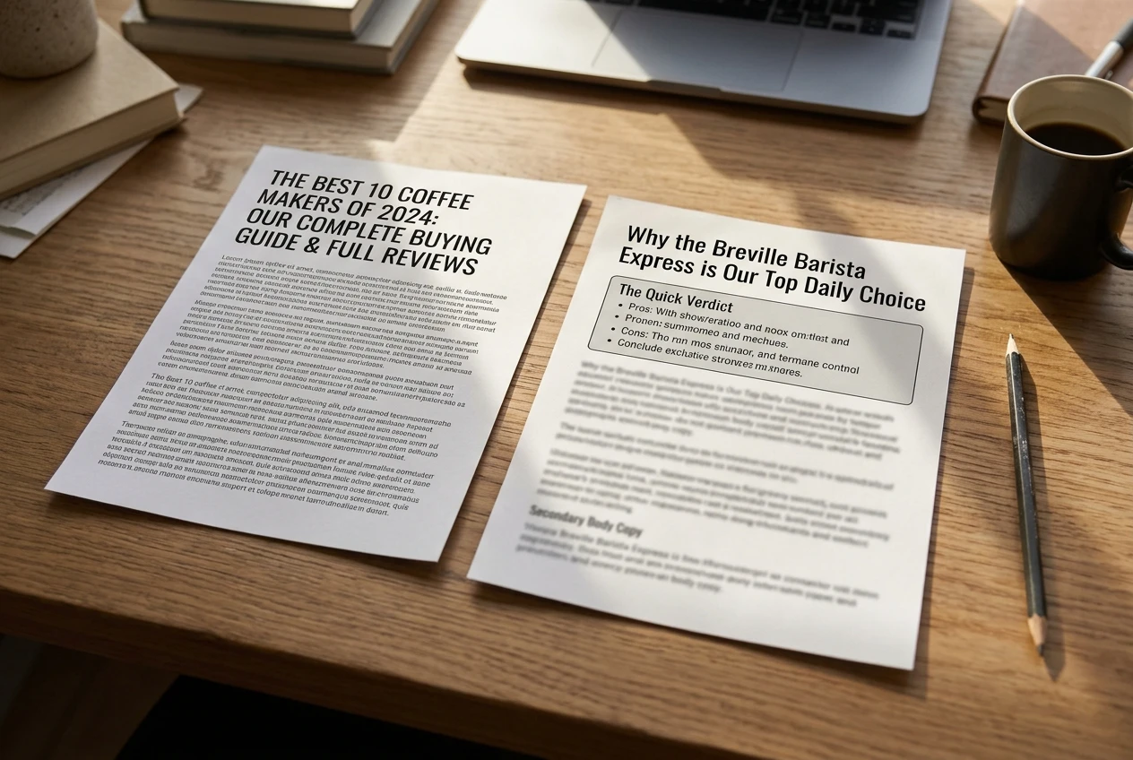
The promise is the specific thing the page says it will help the reader do or decide. “Best Standing Desks” promises a list. “Which Standing Desk to Buy If Your Desk Is Under Five Feet Wide” promises a decision for a particular reader. The second filters readers earlier but gives the right ones a stronger reason to stay.
Options for the variant:
- Narrow the promise. Name the reader, the use case, or the constraint.
- Change the type of promise. Test a list against a verdict (“Our pick, and who should skip it”) or a question the reader is already asking.
- Restructure the first screen. Put a short summary of the recommendation above the first scroll instead of an introduction that circles before it gets to the point.
Change only one of these per test. If you narrow the headline and also rebuild the first screen, a win cannot be traced to either.
Keep the page honest. A headline that promises more than the page delivers raises the number of visitors who stay for a few seconds and lowers the number who click, and your earnings-per-visitor figure will show it. If the first screen test is your starting point, the structure in this breakdown of a review, section by section shows what the opening is usually expected to carry.
Test 2: where the offer appears and how many times
Offer placement is the second-largest lever because it controls whether a reader who is ready to act has a link in front of them at that moment. Many pages place the first link far down, after several hundred words of background, and readers who decided early have nothing to click.
Placement variants worth testing:
- First link above the fold versus first link after the main recommendation. An early link suits readers who arrive already knowing the product. A later one suits readers who need convincing.
- One offer block versus a repeat after each major section. More links raise the chance of a click but can read as pushy if each one is a bare “buy now.”
- A fixed or sticky call-to-action versus none. On long pages, this keeps a link visible without repeating it in the text.
Read your scroll data against this. If readers who scroll to 50 percent are clicking at a good rate and those at 80 percent are not, the offer is reaching them too late or is not appearing again where they stop.
Disclosure belongs near the first affiliate link, and the test variant should keep it there. If you move the link, move the disclosure with it. This guide to disclosure placement covers where it sits best without driving readers off.
Test 3: the comparison block and the pick-for-you recommendation
On pages that cover several products, the comparison block is where most readers decide. If the block lists features in a grid and leaves the choice to the reader, many readers will leave to think about it, and some will not return.
The pick-for-you recommendation is a short statement of who should choose which option. For example: “Choose A if you need X. Choose B if your priority is Y. Skip C unless Z.” It converts a grid of facts into a decision.

Variants to test:
- Grid only versus grid plus a one-line pick for each type of reader.
- Grid with all options versus a top pick followed by alternatives. Showing one clear first choice usually reduces the number of readers who stall, though the strength of that effect varies by niche, and a test is how you find out for your audience.
- Number of columns or rows. Fewer attributes that matter often beat many that do not.
Proof sits naturally in this block, and it is the fifth element on the ranking. Proof means anything that shows the recommendation rests on something real: your own screenshots, a measured result from your own use, a named reviewer’s experience you have permission to quote. Put it next to the pick, not in a separate section, and use only what you can actually show. Adding proof you do not have is not a test variant. It is a risk to your readers’ trust.
Test 4: the sentence around the link, not the link itself
The words immediately before and after an affiliate link set what the reader expects to find after clicking. When that expectation is vague or wrong, the reader arrives at the merchant page, does not see what they were promised, and leaves. Your click count looks fine while your commissions do not.
Compare these two sentences:
- “Check it out here.”
- “See the current price and the three plans, starting with the one that fits a single-person site.”
The second tells the reader what the page will show and which part of it matters. It also screens out readers who do not want what the merchant page offers, which sounds like a loss but improves the ratio of purchases to clicks.
Variants to test:
- Generic invitation versus a specific description of what the destination shows.
- A statement of the next step (“Start the free trial, then pick the annual plan if…”) versus a bare link.
- Placing the link on the product name versus on a descriptive phrase.
This test suits pages where your click rate is healthy and merchant-side conversion is weak. Only change the sentence and the anchor text. If the merchant page itself is the issue, such as a changed price or a removed trial, no sentence on your side will fix it. Check the destination yourself first.
Run it clean: one change, a fixed window, and when to call a result
Most affiliate tests that mislead do so because of how they were run, not because of what was tested. A few rules prevent most of the problems.
Change one thing. Two changes in one variant make the result uninterpretable.

Split traffic at the same time. Show version A and version B concurrently, assigned at random, rather than running A for two weeks and then B for two weeks. Sequential runs mix the effect of your change with the effect of the season, a newsletter mention, a ranking change, or a merchant promotion.
Tag each version. If your affiliate program supports sub IDs or custom tracking parameters, give each variant its own so commissions can be attributed to the version that earned them. Without that, you can compare clicks but not revenue.
Fix the window before you start. Decide the duration in advance and use full weeks, since weekday and weekend readers often behave differently. Four weeks is a common starting point for modest-traffic pages, but the real condition is reaching your minimum event count in each version.
Do not stop early on a good-looking gap. Early results swing widely, and stopping the first time one version leads builds in a false positive. Wait for the window to end.
Set the decision threshold first. Write down the metric (earnings per visitor, with clicks as a secondary check) and how large a gap would make you switch. If the result is inside that gap, call it a tie and keep the version that is simpler or reads better. A tie is a legitimate result and still tells you that element is not the problem.
Watch for outside changes. If the merchant alters its price, commission rate, or landing page during the test, note it. A result collected across such a change may not be usable.
Keep a test log so each win informs the next page
A test result is only reusable if you can find it later. A simple spreadsheet or document is enough, with one row per test and these columns:
- Page and date range
- What the data showed that led to the test
- The single change made
- Primary metric, and the numbers for each version
- Events counted per version
- Decision (switch, keep, tie)
- Anything unusual during the window
The “what the data showed” column matters most over time. After a few tests you will see patterns, such as narrow headlines winning on review pages but not on roundups, or repeated offer blocks helping on long guides only. Those patterns become your default for new pages, and you test the exceptions instead of rebuilding from guesses.
The log also protects against repeating work. If a test came out as a tie, the next test on that page should target a different element from the same table above. Move down the ranking: headline, offer placement, comparison block, link sentence.
When a version wins on one page, apply it to similar pages as a new test, not as an automatic rollout. Pages with different readers or different products can respond differently, and a win that fails to repeat is information about how far the lesson reaches. For a worked example of diagnosing a page and acting on the findings, this case study on fixing content that stopped converting shows the reasoning in practice.